Tuesday, 29 January 2013

Fundraising at Tesco

In order to raise money for our two graduate shows in London (Graduate Fashion Week and New Designers), we decided to hold a stand for a weekend at a local Tesco store in Colchester.  Everything sold on the stand was hand made by us students! There was a selection of velvet devore scarves, jersey scarves, printed cushions and slate hearts.  

Our stand!


A selection of scarves...


The velvet devore scarves...


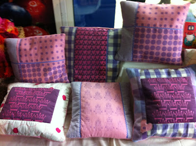
As I am concentrating on children's wear at the moment, I decided to make some cushions for little girls.  I hand printed the cushion fronts using the screen printing method.  I used some of my own designs that are from my current fairytale project.  Crowns, castles, hearts and polka dots were printed onto pink linen and then made into patchwork style cushions with cotton gingham and floral fabric.  They were then embellished with purple rick rack and appliqued hearts. 


It was really interesting to put my own work on show, for sale to the public and see what the feedback was. How people reacted to it and what their opinions were.  Fortunately, most of the cushions were sold over the weekend, with the crown and heart prints being the most successful!  I was so happy to see this as it meant that people liked my designs, and it assured me that I was producing work that people would buy.

Overall it was a successful weekend! We raised a good amount of money and gained feedback on our work.






Saturday, 19 January 2013

Sleeping Beauty

I love this fairytale! The colours of the Disney film are beautiful and this is what inspired my colour palate of pinks and purples. It is one of the ultimate girly fairy tales therefore I need to make sure that I create beautiful designs that are attractive to my target audience.


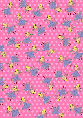
Inspired by crowns, jewels, hearts and fairies. I have created designs that include all these features and I am pleased with the results..


Experimenting with linear fairy drawings and developing them in Photoshop...


Another floral print!!


Birds are also included in my designs as little characters...


Heart prints both digital and screen printed are also included.  I think the heart print is very effective yet simple.


Screen printed heart design with overlay of metallic foil hearts to add sparkle.


Inspired by an image of a brooch I created this hand painted design which featured different contrasting shades of pinks and purples.


Developed through Photoshop, it adds a less graphic and bold feel to the design and more of a soft, subtle one.


Once again contrasting digital castle print with hand printed one...

...I think both are successful.


Finally the crown print which is one of my favourites!


I intend to do more hand printed sampling to see the contrast between graphic prints and hand printed ones...


Red Riding Hood

 When creating the prints for this fairytale, I always had in mind the colour red to work with simply because its an obvious theme within the story.  I have also combined the colour orange and navy blue heavily as well because I feel they contrast well.

Here are some print designs so far...


As the wolf is one of the main characters within the story, it was very important that I include a wolf character in my designs.  However I did not want the wolf to be scary, as it is not appealing to have a scary wolf face on a garment.  This meant that I had to research and see how I could make my wolf a cute/funny character.

This is what I have come up with...


Hand painted wolf using watercolour, scanned straight into Photoshop and developed further...


I think these two prints are very successful.  I love combining the hand painted look with the digital graphic background.  I think it is different and unique.

The forest also features heavily in the story, therefore I decided to create some quirky trees to play around with.  I thought that the more quirky the trees were the better as it shows a fun aspect to the designs and not a classical one.


Taking the forest design further by breaking down the elements of the tree and the branches.  Using oil pastels and acrylic paint over the top.  I was pleased with the result and also scanned this into Photoshop to see the results..


Makes a nice border print...

I also can't help but add a floral into this collection!!


An example of the digital floral layered and the hand printed floral over laid with metallic foil..


Overall I am really pleased with these fairytale designs, I love my wolf character and it has been refreshing to move away from the colour pink and experiment with more oranges, reds and dark blue.


Hansel and Gretel

I have been very busy creating new prints inspired by my next fairytale: Hansel and Gretel.  My main inspiration from the story is the sweetie house.  When I was younger, I loved looking at the illustrations of the house and seeing the brightly coloured sweets stuck to the outside, as a child I found it very appealing!! This is why I am focusing mainly on sweets, candy canes and gingerbread men.  They are very fun and exciting things for children and this is the feeling I want to create through my designs. An excitement for children when they see the finished prints.


Starting to create prints of the sweetie house, I drew the outline and scanned it into Photoshop and worked into it adding extra detail and playing around with the different colours.


A different style house, layered onto two different backgrounds.  I think the houses look better as a border print and on a polka dot background.


'Floral Sweets'

These are two of my favourite prints for the collection.  They are different from the other prints because they are not so child like.  I was inspired by a 'Liberty' print.  I love the ditzy print design and I think it works really well on children's wear because it is on a much smaller scale in comparison to women's wear.


Hand drawn gingerbread men developed into digital gingerbread men...


I think both gingerbread men prints are successful.  They look cute and appealing to a child.


Experimenting with a sweet print.  I like the hand painted sweets as they have more depth to them rather than the graphic ones.


So far I am pleased with the print designs I have created for this fairytale, I still need to work into the sweetie house as this is one of the main aspects of the story.