Monday 26 November 2012

Princess and the Pea...

I started to create some artwork inspired by the fairytale, 'Princess and the Pea'.  I was inspired by the mattress that features in the story, I was trying to re create the different layers of the mattresses within my prints, each one with a different colour and pattern.  Also looking at the pea within the story, I initially thought of polka dot prints.  I have experimented with hand techniques such as paint as well as digital ones through Photoshop to create these initial print designs.


Inspired by the moodboard on the left.  Looking at bead work within a bag, the circular embroidery reminded me of the pea.  Working with a linear drawing and developing it into Photoshop.


Layering polka dots using acrylic and gouache paint on a background of blue ink.  I like the colour story in this print..

Again working with layering polka dots but using the media of ink and bleach, then pink glitter glue over the top.


Inspired by a floral print on the left using Photoshop and then another polka dot print on the right.  I experimented bubble wrap to create a messy polka dot background then a collage of green and blue spots over the top.  The spots are cut from the Princess and the Pea story.. 

Developed this in Photoshop, more layering of polka dots!


Finally inspired by the mattress in the story, I created different stripes (both horizontal and vertical) each filled with a pattern.  I think I am going to work with stripes horizontally because the vertical ones remind me of deckchairs!


Experimenting...

I found this piece of artwork I created successful because it was quite spontaneous.  I was just playing around with a line drawing of a castle I created and then thought of different ways to add colour into it.  Using a watercolour paints as a base I created a quick background of different sections of colours for the castle to sit in.  Then I drew a black fine line castle on top of the background, and finally using the tube of paint as a brush I painted dots of acrylic onto sections of the castle.  I like this because it looks quite messy as the paint has not stayed within the lines.


Original drawing..


Scanning the drawing into Photoshop, changing the colours and the scale.  Also distorting the image to create more of a quirky style castle...


Scanning the line drawing into Photoshop and playing around with simple, contrasting colours.  I really like the line drawing as well as the painted version.  I think both of them sit together nicely if they were to be combined on a garment.


I think this linear approach would also look nice as an interior fabric or a wallpaper because it is simple but there is enough detail to attract attention.


Drawing and Experimenting...

The project for semester one is to design and make 12 textile fronts for Premier Vision exhibition in Paris.  They will be on sale in the 'Indigo' section of the fair.

I am focusing on six fairytales: Little Red Riding Hood, Cinderella, Sleeping Beauty, Hansel and Gretel, Snow White and Princess and the pea.  So far I have been roughly sketching and painting imagery which features in most of the stories.  Castles, stars and hearts have been my basic inspiration at the moment.  My plan is to focus on more specific imagery for each fairytale as I progress through the project, for example my Hansel and Gretel designs will feature the gingerbread house as well as simple trees which are inspired by the forest.

Here are some images of my initial drawing and sketches for my fairy tale inspired 'Indigo' project.

I started thinking about my colour palate, I wanted to include bright colours as well as darker colours for depth.  I was inspired by the colours that are associated with the stories as well as the Disney films.  Each design will have different amounts of colour used within each one.  For example 'Little Red Riding Hood' will feature a lot of red whilst 'Princess and the Pea' will include lots of green etc..


Creating some simple shapes using collage technique onto different backgrounds.  I think stars are a really simple but effective pattern.  I experimented with different scales...


A quick sketch of a flower, I really like the colours and textures of the flower.  I then thought about dissecting each piece of the flower to create a pattern rather than a copy of an actual flower.  For example I created a stripe pattern from the flower by using small sketchy likes and dots.

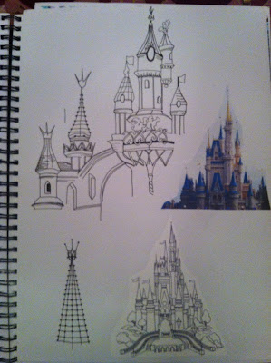
Quick line drawing of the iconic princess castle in Disney land.  I love working with just a fine line pen, the result is a detailed drawing with different amounts of shading.  A nice alternative to using colour..


A watercolour painting of a more simple castle with hints of gold glitter glue to add sparkle.  To take this further I can scan the original painting into Photoshop and play around with the different scales and repeat.  This could make a nice border print or a placement print.  To add sparkle to the design I can use metallic transfer foil..


Pop design study day...

Back in October I went to the POP! Design study day at the Fashion and Textile Museum in London.

'An exploration of design, culture and fashion from 1956 to 1976 in the presence of the designers, artists and retailers who helped create British Pop Culture.  The themes for discussion are 'fashion and pop music', 'the silk screened image', styling the self', 'pop boutiques and the new retailing' plus 'pop materials and the legacy of the throw away culture'.  Speakers range from key designers whose work features in the exhibition to curators and academics.' 

I decided to go to the study day because I was interested to see what was going to happen.  I had previously   seen a little bit of the POP! exhibition whilst working at the museum in the Summer, but I didn't have a proper look!  So I thought it would be a good opportunity to see the exhibition as well as meet some of the key designers whose work features.  The day was divided up into discussions hosted by different people.  My favourite discussions were 'The Silk Screened Image' and 'Styling the Self'.  'The silk screened image' included designers Natalie Gibson and Sue Timney.  This was so interesting as they spoke about their life stories, influences and careers as well as showing some of their own work.

'Styling the Self' included discussions by Justin de Villeneuve, Andrew Logan, Marsha Hunt and Keith Wainwright.  This was a great talk because there were discussions from every view point - the view of a designer and the view of an iconic hair dresser.

It was great to be around such influential people and in such an inspiring environment.


Sue Timney and Natalie Gibson speaking about their work.
I found it really interesting to see two designers speak about their different work.  Even though I am a big fan of using colour, I love Sue Timney's work, the use of just black and white is amazing. 

Wednesday 21 November 2012

Ciment Pleaters

I love the different pleating techniques that can be created by the company Ciment Pleating.  The designs range from a simple pleat to a very intricate one but they are all amazing.  I was fascinated to hear how they craft each design in cardboard by hand using different folding techniques.  I am definitely thinking about using some pleating within my final children's wear collection, I especially love the designs called 'Pineapple', 'zig zag' and 'zig zag coral'.